Objects & Piece

 In the context of an asset set, the ship created using set colors and a limited color palette exemplifies a thoughtful and strategic approach to pixel art design. By establishing a defined set of colors, the artist ensures visual cohesion and consistency throughout the asset set. This deliberate decision enables easy integration and seamless compatibility with other assets within the set, fostering a cohesive and visually unified experience.
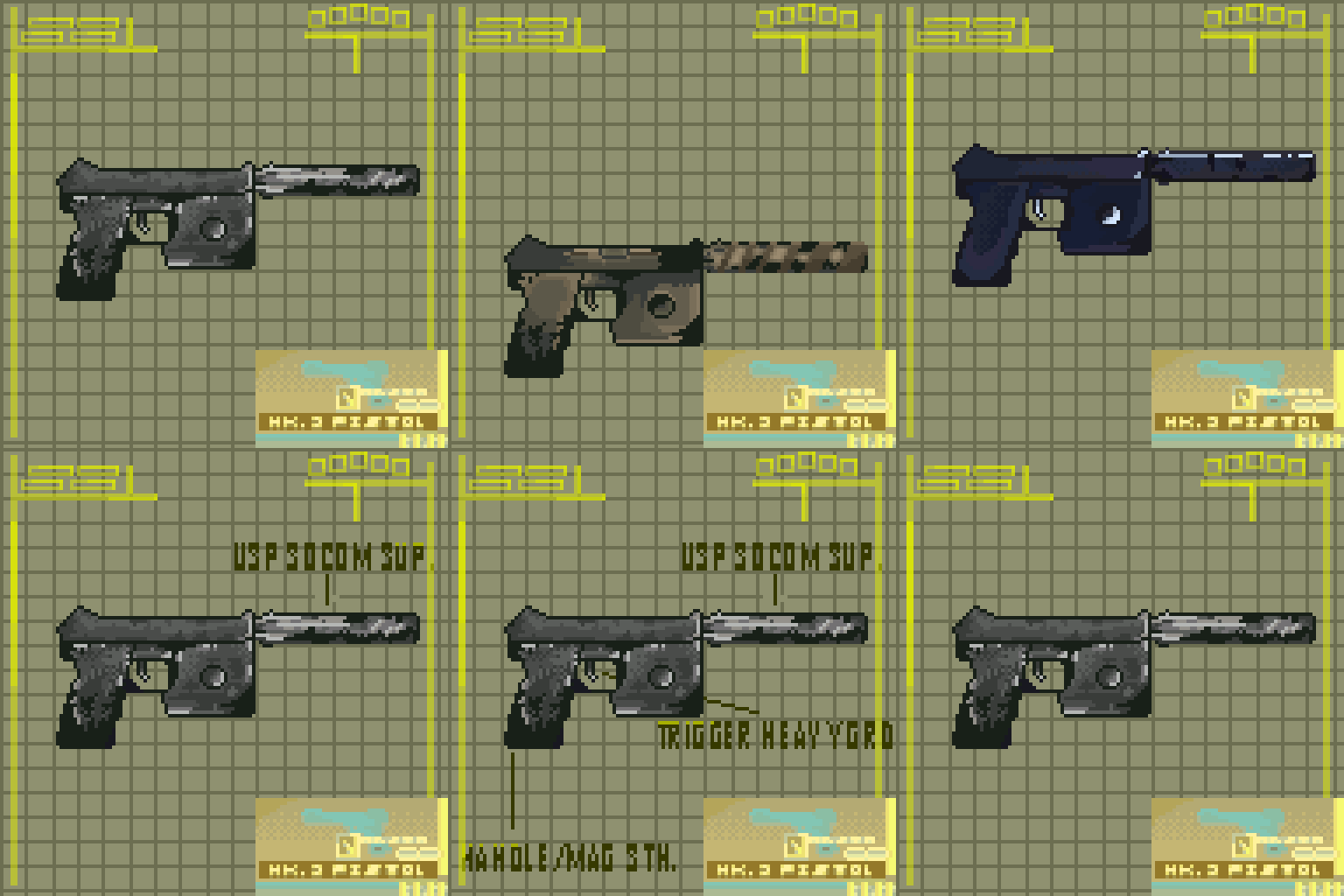 The concept art for the USPS (United States Postal Service) from Metal Gear Solid, designed with a similar user interface (UI) to MGS4, reflects a meticulous and thoughtful approach to pixel art concept design. By drawing inspiration from the UI elements of MGS4, the artist acknowledges the significance of visual consistency and immersion in game design. This decision not only pays homage to the iconic Metal Gear Solid franchise but also ensures a sense of familiarity and cohesion within the concept art.
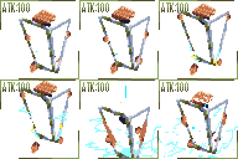 The concept art for a lightning shield attack, designed for inclusion in a Dungeons and Dragons-type asset pack, showcases a meticulous and strategic approach to pixel art design. This concept art serves as a visual representation of a powerful defensive spell or ability that players can utilize in their tabletop role-playing adventures. The artist's attention to detail and understanding of the fantasy genre are evident in their careful execution.
In pixel art, conveying the dynamic nature of an attack can be challenging due to the limited resolution. However, through strategic pixel placement and animation techniques, the artist effectively captures the essence of the lightning shield attack. The concept art showcases the shield's intricate design, featuring intricate patterns and glowing electric arcs. The pixel art medium allows for precise control over each pixel, enabling the artist to create crisp and well-defined lightning effects that emanate from the shield. The careful use of contrasting colors and shading techniques enhances the sense of energy and movement, bringing the lightning shield attack to life on the screen.
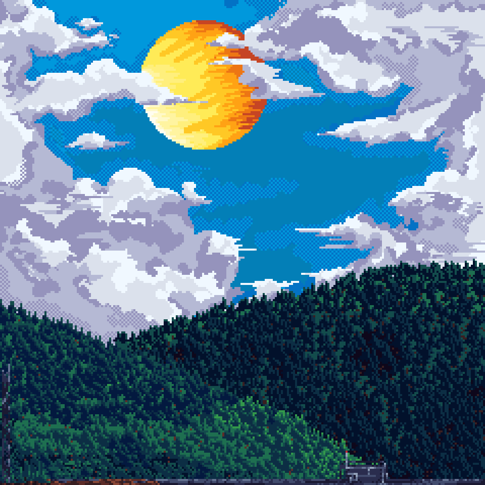 The pixel art forest depiction of a sunlit valley showcases the artist's skillful use of limited colors, dithering, and halftones to create a visually captivating and immersive environment. The meticulous attention to detail and thoughtful execution of pixel placement allows for the portrayal of a lush and vibrant forest scene within the constraints of the pixel art medium.
By utilizing a limited color palette, the artist maximizes the impact of each color choice, emphasizing the natural elements of the forest while maintaining a harmonious visual balance. The limited color range encourages the artist to carefully consider the shades and tones needed to represent the various components of the scene, such as the trees, foliage, and sky. This deliberate approach enhances the coherence and unity of the artwork, evoking a sense of harmony within the forest environment.
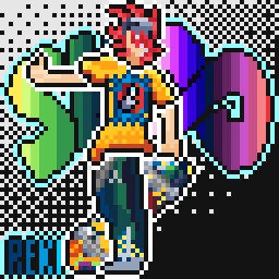 The commissioned pixel art piece depicting "Reiki" from the popular show SK8 demonstrates the artist's analytical approach to creating a visually captivating artwork. The use of various colors illuminating the logo against a black and white background adds a striking contrast and draws attention to the focal point of the artwork.
The artist's careful selection and placement of colors for illuminating the logo showcase their understanding of color theory and composition. By utilizing a variety of colors, the artist effectively captures the energy and vibrancy associated with the character "Reiki" from SK8. Each color choice adds depth and visual interest to the logo, enhancing its impact and reflecting the character's personality and presence.
 The animated assets are designed to seamlessly loop, ensuring a smooth and continuous animation that adds life and realism to the forge scene. The artist's analytical mindset allows them to understand the nuances of fire animation, taking into account factors such as flickering flames, glowing embers, and billowing smoke. By studying the behavior of real fire and employing pixel art techniques, the artist creates an engaging and captivating animation that effectively simulates the mesmerizing dance of flames within the forge.
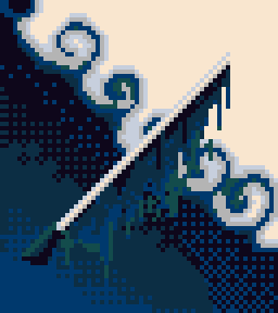 A sword like the other below it, for concept art of a commisioned thumbnail for a client, using lines instead of a spray to indicate its texture and type of mood it should give off as more serious than the one below.
 Another commisioned sword like the one above it, the style and shape language it gives off is a lot less serious than the one above it, using outlines, bubbly shapes, dull and short lines, and making the "smoke" effect makes it seem less harmful and a lot more playful
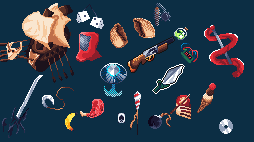 The collection of commissioned pixel art objects showcases the artist's analytical and versatile approach to creating assets for games, including icons, thumbnails, and concept art. By catering to various styles and types, the artist demonstrates their adaptability and understanding of the diverse visual requirements within the gaming industry.
Each commissioned object within the collection is meticulously crafted to serve a specific purpose, be it as an in-game icon, a thumbnail for promotional material, or a concept art piece. The artist's analytical mindset allows them to assess and comprehend the unique needs of each asset, ensuring that the visual representation effectively communicates its intended function and purpose.